Watch Your Backgrounds!
 One of your responsibilities as a photographer is to ensure that your photo "reads" well. That means no distracting elements in the background. If you're working for a corporate client, you want your client's logo in the background where it won't be cropped out, but not so much that it looks too commercial.
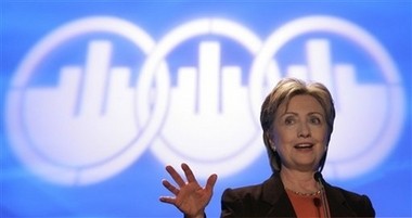
Maybe it's just me, but I wouldn't have wanted this background to have to work with for all the tea in China. I ran across it over at The Wonkette, and did a fair amount of research to try to find the source/date and so on, with no luck. Feel free to share what you know about the details of this event in the comments.
Please post your comments by clicking the link below. If you've got questions, please pose them in our Photo Business Forum Flickr Group Discussion Threads.

9 comments:
As a photograph, it works pretty well, though - Mrs Clinton's hand looking like it's imitating one of those logos.
Perhaps I'm being a little childish, but grabs me most is that fact that their logo looks like a graphic-design of flipping the bird.
Sexdwarf,
Perhaps? And you have a name of sexdwarf and you are saying perhaps you are being childish?
Anyways, your statement is the whole point of John's post. It does look like the bird and that is why it is not the best photo for Clinton.
I agree with John to a point, but at the same time it is not the role off the photojournalist to decide what is right and what is wrong, but to photograph what is there, and this is what was there.
Hilarious...... Or, Hillary-ous.....
Bruce, if you're acting as a PJ you're right. If you're doing PR shots for the candidate.... not so much.
the background doesn't bother me at all. I do mostly commercial work and this is what the client is looking for. A lot of PJs would hit this shot from the side (Clinton in profile) to avoid the logo all together. But, as Carlos said, if you're shooting PR, this is the gig.
Having said that, the only thing that bothers me is the crop and the "phantom hand". (Where it leaves the frame and comes back in.) Well, that and the angle of her body leading the viewer's eye off frame.
Bruce, I was being intentionally obtuse for humorous effect. Its obvious what he means. If my name is childish to you, what that actually means is the reference is over your head.
mhakola - I think you missed my point. If you're shooting PR you'd probably want to avoid a shot that makes it look like triple giant middle fingers raised in salute to your candidate. If you're doing PR for the owner of the unfortunate graphic, this would be on the money....
Carlos, I see what you're saying but if I'm shooting PR (which I do more than I'd like to admit) than I probably AM hired by the company with the unfortunate logo.) This might also be cropped tighter if run in a paper so the ring on the far left might be cropped out, therefore minimizing the obscenity factor. Anyway, it certainly is an unfortunate logo and I'm hoping someone got sacked for it.
No, wait; it's a dessert topping, no it's a floor wax; OMG it's photographers being funny.
How many of you full-time professional photographers have the time to be funny when our business is crumbling around us and lays near ruins at our feet?
Leave the funny jokes for the wannabees.
Post a Comment