 So, how many times have you had a client call to say "the color is too dark", "to pink", or they otherwise object to how it looks on their screen?
There are several factors causing this - screen age, viewing environment, calibration, and gamma. "That's not my problem!" you say. Yes, it is your problem if you want to keep the client happy. Just as it was our problem to ensure that the prints we delivered back in the days of analog was our problem (which usually meant we pressed our lab to print things right, meaning color balance was their problem), or we ensured that the E-6 lab (may they rest in peace) processed the slide film accurately, and we further chose film that did not have any color cast (rue the day you shot Velvia with any type of flash -- hello 30 points magenta!), it is our problem that what the client sees on their screen is as faithful a rendition as possible of what we saw on our screen. So, let me explain the above factors.
 If you''ve ever seen a non-flatpanel (i.e. old school screen type) where you can see that something's been displayed on the screen for a very long time, that's called screen burn in, and is a demonstration of the fact that the screen's phosphors age and wear out. That is why screen savers were invented - literally, to save the screen from constantly displaying one image, thus causing that image to burn into the screen. Where items and objects move (like the flying toasters, or the manufacturers logo) the burn won't happen. On an LCD screen, there is much less likeliness that you'll get screen burn, what you usually get is " temporary image persistence", meaning that the image looks like it's burned in, but most of the time, it goes away after a short period of time. A typical LCD lifespan is 50,000 hours of use compared to 15000 to 25000 for a CRT. Lifespan, however, is referring to when it will no longer function, not when it can no longer be calibrated. I would submit that those figures are about half of the above numbers. So, for a CRT, where someone has their computer on 10 hours a day, that's about 2.8 years on the short end, and when left on continuously, that's a lifespan of less than 1 year. For the LCD, at half-life, that's 2.85 years before you can expect your LCD to fail.
To that end, when I am talking to a concerned client, I will ask them casually how long they've worked at their job. When they say "oh, I've been hear four years", and I then ask "have they given you a new computer since then? New Monitor?" When they say "no", I know the culprit immediately.
Another factor that could cause the client to express concern about the image quality is the environment a monitor sits in (and that means, the desk where your client is reviewing your images) affects how the image looks. Reflections from windows, lights, and so on will cause the image to look different. Further, while it may be possible to have an infinite range of color on an analog monitor, a computer can't deliver on that capability, since the ratio of intensity between brightest white and darkest black is called the contrast ratio and it changes for each environment. Images presented using an analog slide projector has a contrast ration of approximately 80:1, however, because of overhead lights, window light, and so on, most office environments have a limit of about 5:1.
One more point to be concerned about is the fact that images on a PC look darker than on a Mac. Why? Read Gamma Correction for Macs and PCs for a really great explanation of the issue of Gamma on each machine. Suffice to say, it IS different.

 Lastly, if you've ever walked into a Circuit City or Best Buy, and looked at a wall full of monitors, displaying the same image, but some looking better than others, while brand can be a point, the more germaine point is that none of the monitors were adjusted and calibrated to look their best, they were unboxed, and plugged in. Further, I've heard of sales managers going in and making the "on sale" monitor look it's best by making adjustments to the color/sharpness and so on causing the buying public to gravitate to the one on sale. The point is, you must calibrate your monitor using the Pantone Eye-One Display 2 or the ColorVision Spyder2PRO
 calibrators so that you have set your monitor to a known industry standard scale. Once you've done that, whatever you deliver, will be independantly "perfect", and when someone looks at the image on a non-calibrated monitor, you will have some ground to stand on, and a review of the image(s) on the monitor in the clients' art or graphics departments (where hopefully they are calibrated) will alleviate your clients' concerns.
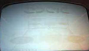
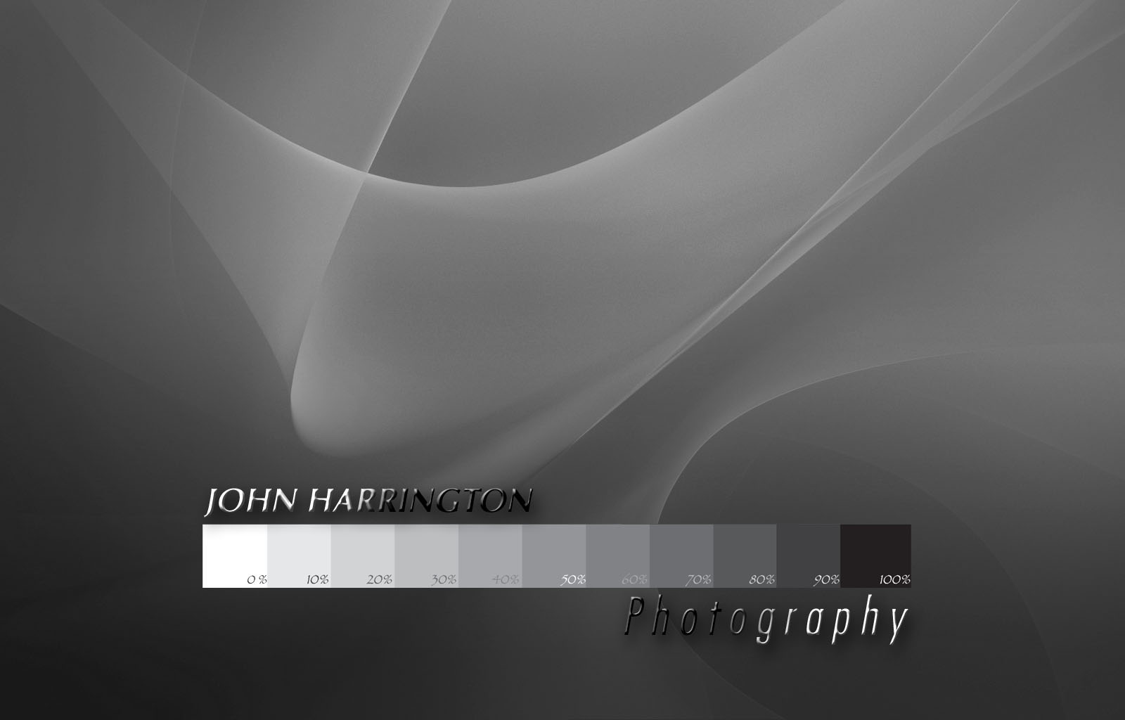
Once you've gotten yourself squared away, the next thing to do is square away your client. I created a faux-calibrator that gives me some standing with the client. Below is the image, and you are welcome to click on it to see the image larger (and thus, more readable), that accompanies EVERY client deliverable we send out.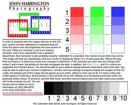
So, when the call comes in, I simply ask the client to go to the first image they see, which is the image above. I then ask "At what point along the bottom do you begin to see a shift where there is a line between the numbers?" When they say "between 3 and 4" I know there is a problem. (oh, and for those of you saying "yeah, that's where I see the change", you need to be calibrated! Click above and spend the $200 on a calibrator, I own the Eye One brand. On the scale, there is a change in darkness, by 10%, from 1 to 2, 2 to 3, and so on.) Then, when they say something about the background looking slightly pink (ususally preceeded by my saying "does the background of the image look a little pink?" I then help them with some very basic adjustments to their monitor, usually resulting about 99 times out of 100 with them saying "oh, the images look so much better now....", and that client is no longer believing that I was the problem, but realizing that it not only was just their monitor, but, more importantly, I was willing to walk them through fixing the problem, and that I knew how to fix it.
For a really valuable client, I have been known to bring my software and hardware down, and calibrate their monitor for them, or, on one occasion, I spent the $200 and bought the client the calibrator, installed it, and showed them how to calibrate it themselves. This client has come back to me time and time again, as I am a trusted "vendor", who cares to go the extra distance to serve their needs, and has, far and away, paid me for the nominal investment of the give-away calibrator.
Many years ago, well regarded boston photographer Stan Rowin gave me permission to replicate his more advanced screen calibration that he has on his website, on mine. Here's mine: www.johnharrington.com/calibrate/ and as you can see, that counsel - encouraging any clients with a problem, to visit that URL on my site, is in each deliverable. Stan has a link on his home page whereas my link is not, it's just a URL that the client can enter if they are so inclined.
When you can address this issue right off the back, you can can alleviate any client complaints about image quality as a result of work done on your end.
also, with the filename "0-set-screen-color" it always places that file at the beginning of the image catalog delivered, or at the top of the folder directory, so I am always sure they've seen it.
With this, I hope that you find you are able to better serve clients, and more importantly, help them resolve image quality concerns.
Next on this topic of calibration, is my desktop graphic...stay tuned.
Please post your comments by clicking the link below. If you've got questions, please pose them in our
Photo Business Forum Flickr Group Discussion Threads.
[More: Full Post and Comments]
 Today was an interesting day. I spent the morning with an electron microscope, the afternoon with an ambassador, and this evening with a Member of Congress. I am currently sitting in the lobby of a hotel that is far more expensive than I can afford, crafting this missive. What prompts me to write today? Oh, the world-wide-web. Yes, that wild-wild-west of the photographic landscape, where people with pictures are under the impression that the fact that they have a JPEG means they can put the photos on Flickr, MySpace, or their own company website. Oh, so wrong.
  Many a time I've been heading into a client's office for a meeting, and stepped on the elevator with one or two other folks. On the ride up, I was concious that, maybe one or two of the other folks I am in the elevator with may end up being in the meeting with me, so I'd better not say anything that would put me in a poor light. My tie better be adjusted, or I shouldn't be finishing a donut or soda while heading skyward.
 Ok, so, just as I hate it that people are stealing Microsoft's Windows, and Adobe Photoshop, I too get upset when the Galactic Empire's IP gets (allegedly) stolen. Worse yet, it's by an organization I really admire --
  If that's the case though, then why is this now the article? It's the same article, but the photo has been removed entirely, not replaced with a non-watermarked one.
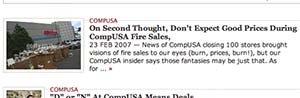 On the heals of that photograph however, comes a bit of history. A search of The Consumerist yields
  From our friends at the Coloradoan.com, comes this little insight:
 When you're taking your laptop (or, maybe desktop for a big shoot) on location to an assignment, what does your desktop look like? Is it professional? Helpful?
 I'm headed to Chi-town! The last time I was in Chicago it was for a guerilla-style photo shoot along the shoreline, no permits, no plan (as the client dictated), and, at one point, no subject! (ask me about that at the presentation.) I am looking forward to my trek there to talk business with a bit more advance planning! Each time I gather with a group of people who are so focused on growing their knowledge about the somewhat confusing side of the business of photography, I get excited. If you've got a copy of my book, and feel it'll be worth more when you sell it on e-bay with my signature, bring it down and I'll be happy to sign it, as it's not for sale there.
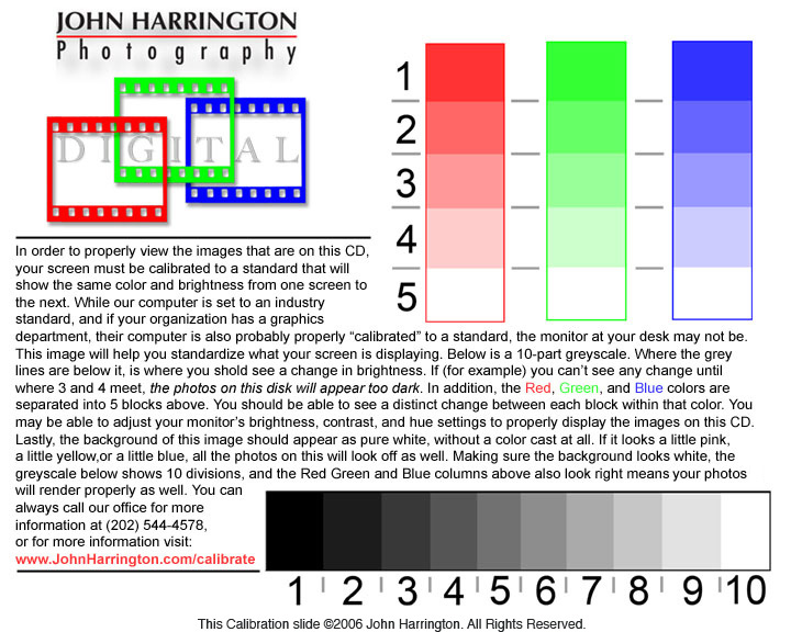
 Back in the free-wheeling days of the early 80's, drug use was rampant. It was, however, much more intense (and deadly) than that of the 60's, where it was free-love and pot, with the occasional 'shroom and LSD for the heavy. Cocaine, Heroin, Speed, Crank, Meth, and so forth and so on, were the problems that lead Nancy Reagan to launch her "Just Say No" campaign,
  and it really was a black and white issue. Even McGruff the Crime Dog was roped into the effort. It wasn't "don't drink and drive", "don't smoke a joint and then use heavy equipment." There was no grey area, no refuge where, if the circumstances were right, drug use was okay. It was clinical fact that using drugs detroyed - forever - brain cells.
 The Advertising Photographers of America even jumped into the fray, when ad agencies tried to secure photography for their campaigns on spec. A revolt lead many of the prestigious agencies to stop asking for spec work, yet this still pops it's head up from time to time.